
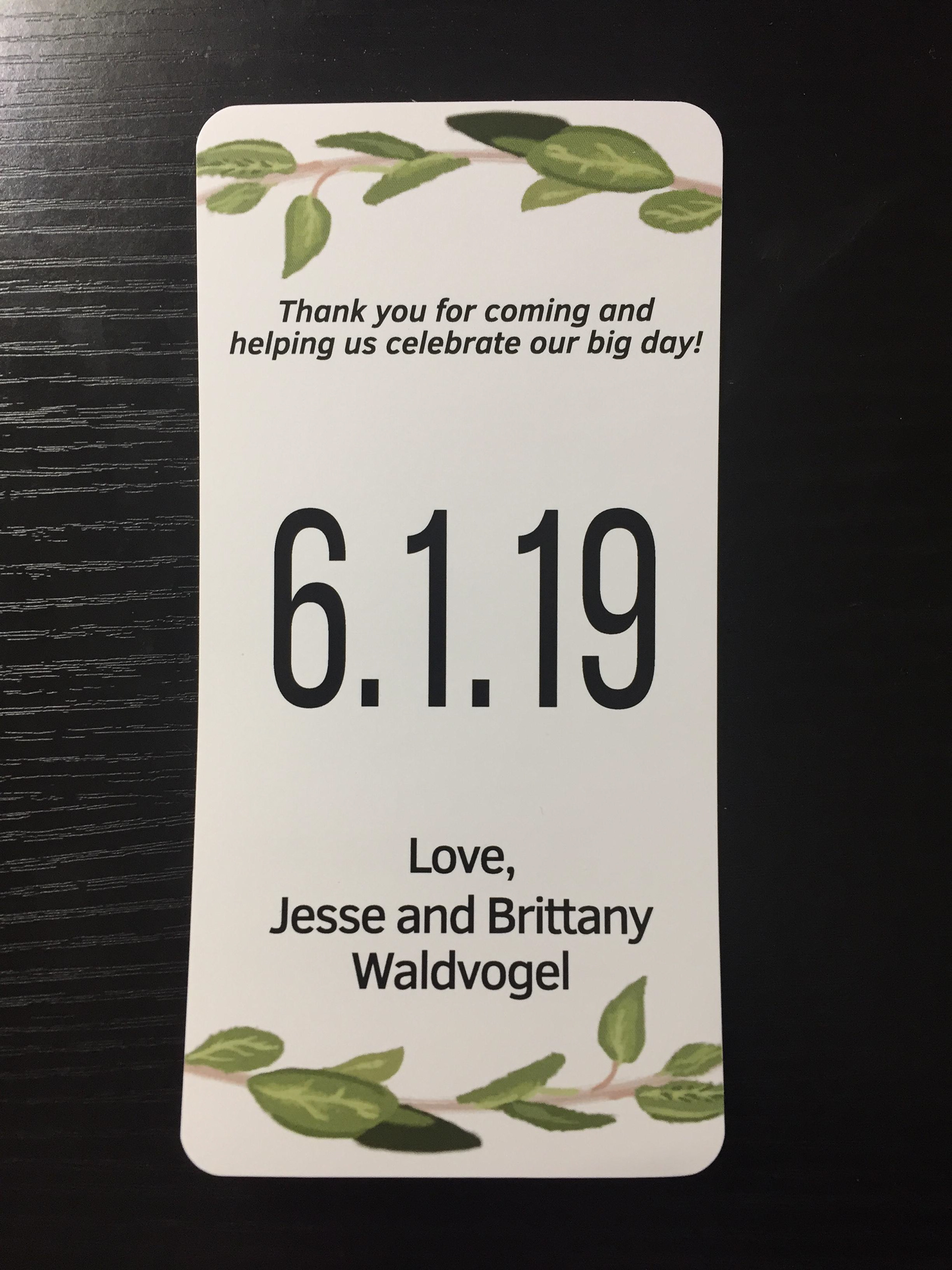
Wine Bottle Label
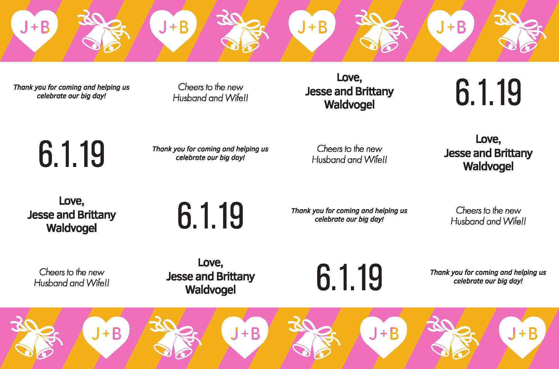
Final Rough Draft 2 Again another version of the wine label with different aethestics, this time having stripes at top and bottom to lead the viewers eye around the bottle.
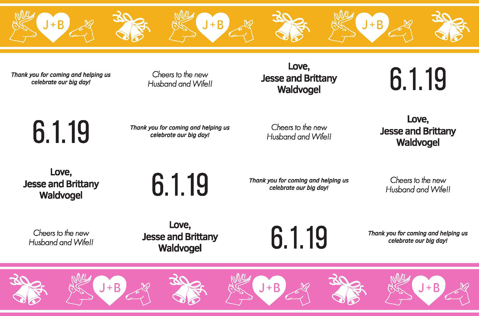
Final Rough Draft 1 This was my first version of the wine label given my clients feedback.

Drawn leaves I created for the bottle label

Rough Drafts and Sketches Writing down important information I need to remember. Also outling what I need to accomplish and simply drawing out ideas.
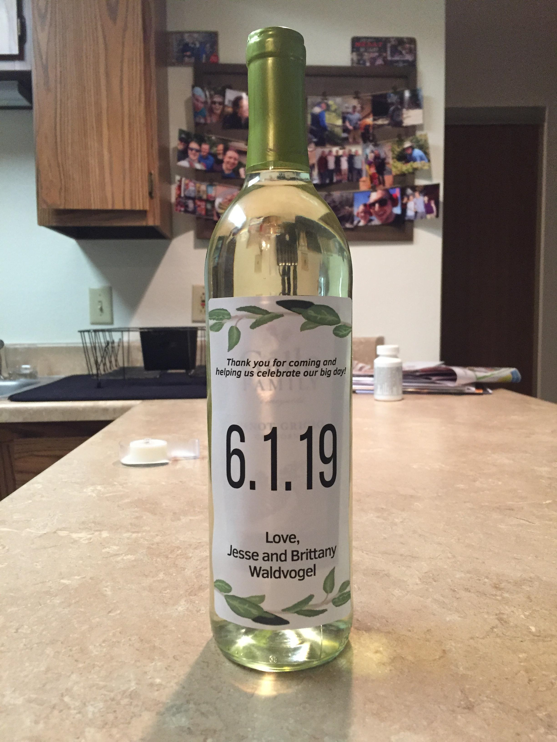
Finally! All Put Together!! The label finally on the Wine Bottle after all the effort put into it. Matched the clients request and more!!
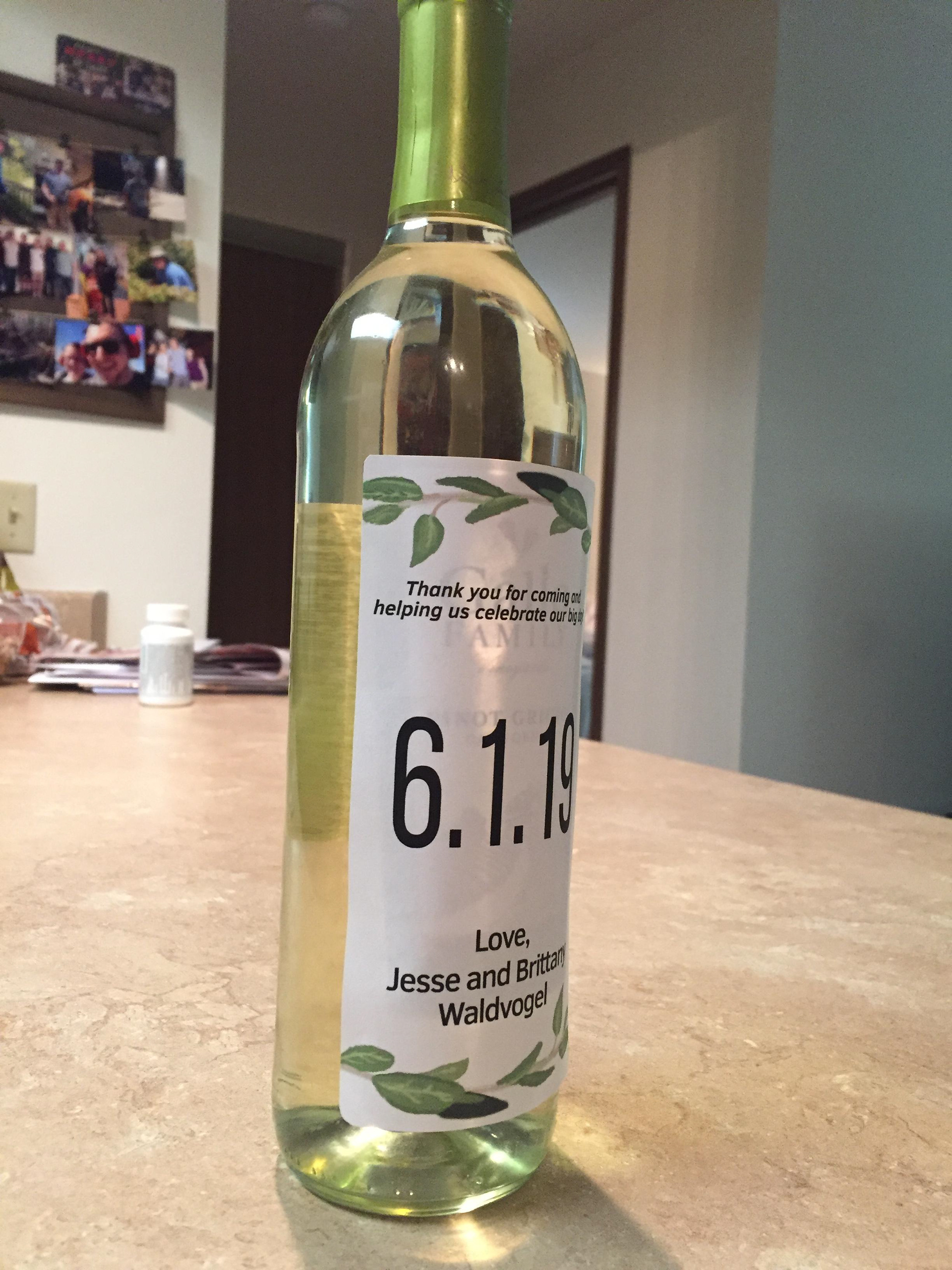
Label on Bottle First photo in good lighting to help show it off! Adhering the label to the bottle, no slippage and no errors.
Printed Demo Label The demo label design, testing size to make sure it is legible and usable.
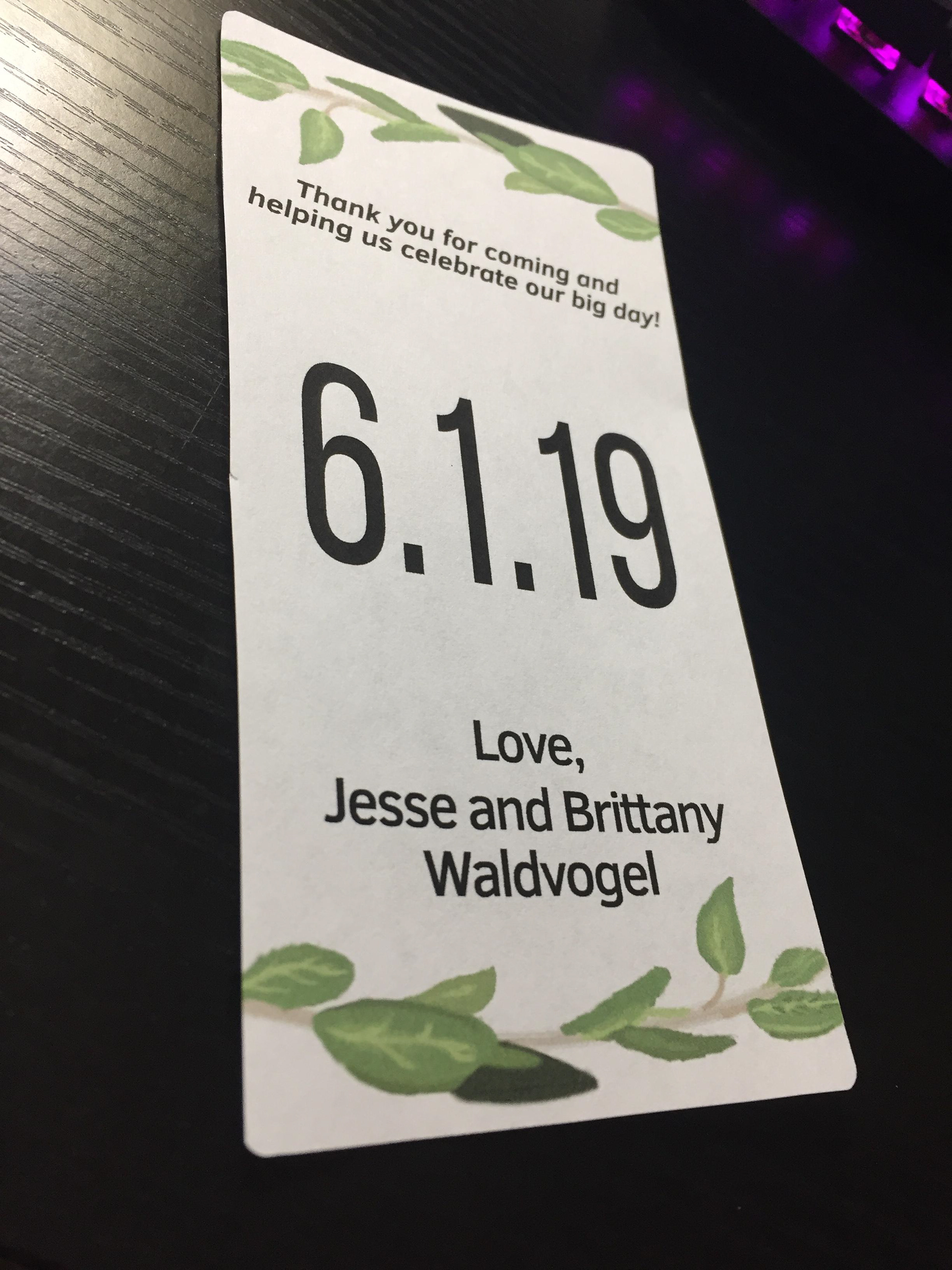
Demo Label Printed (Side) Another angle of the printed demo version of the label.
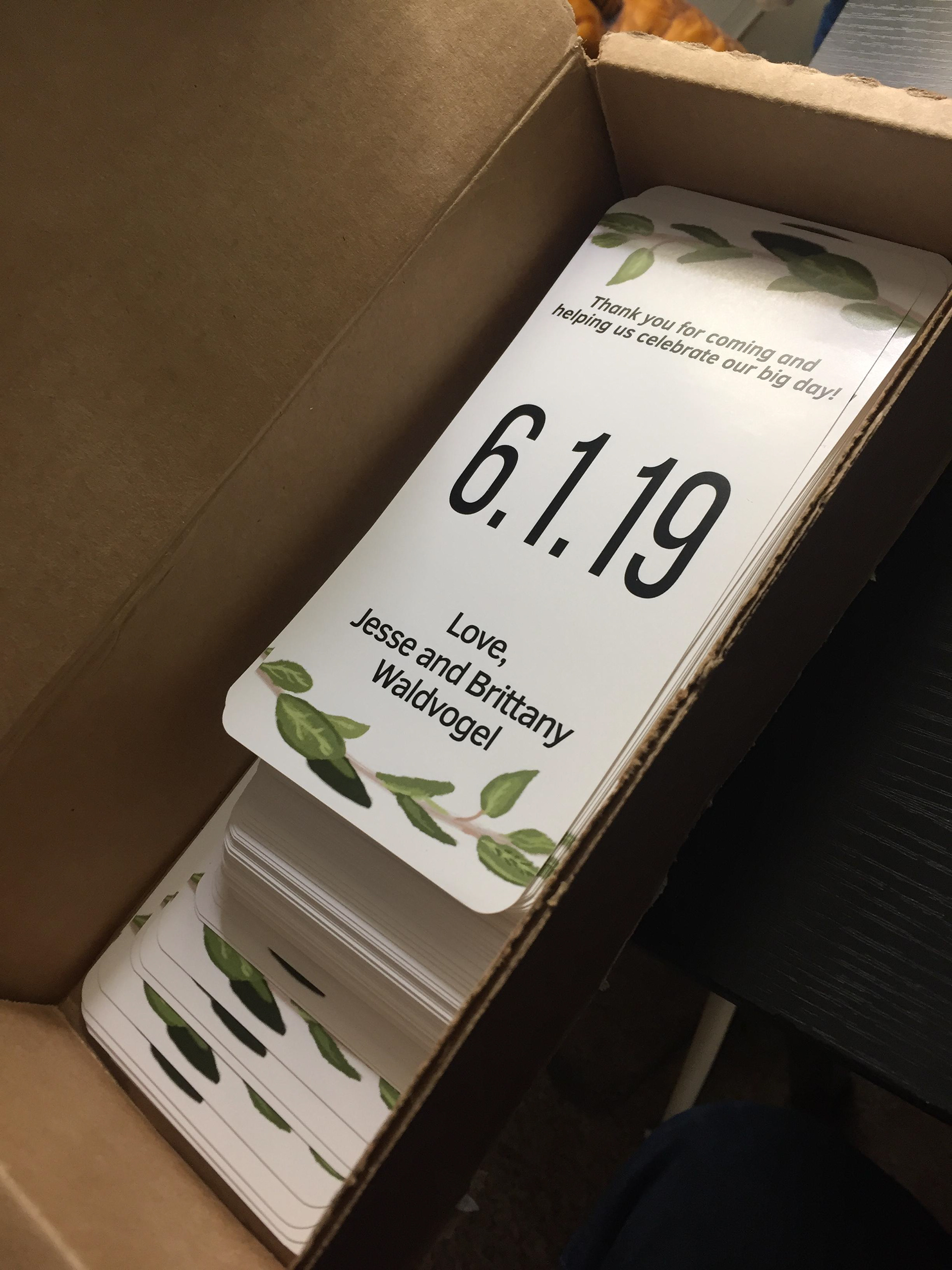
Package of Final Labels The final amount of labels arrived in the mail and am now checking them for defects/errors!
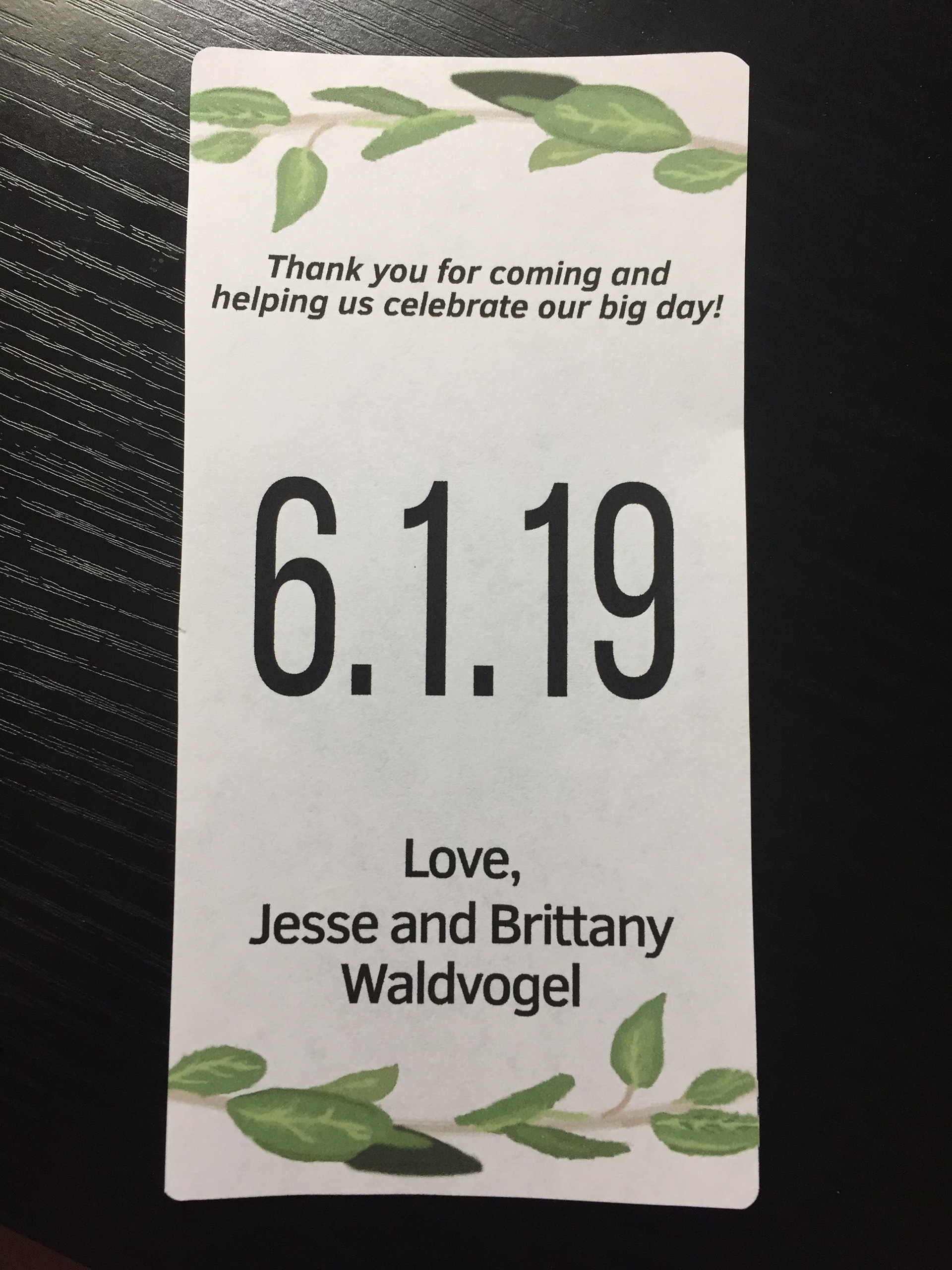
Final Label Design Printed off a copy of the final label design they wanted to go with. Again printing a demo for quality assurance.
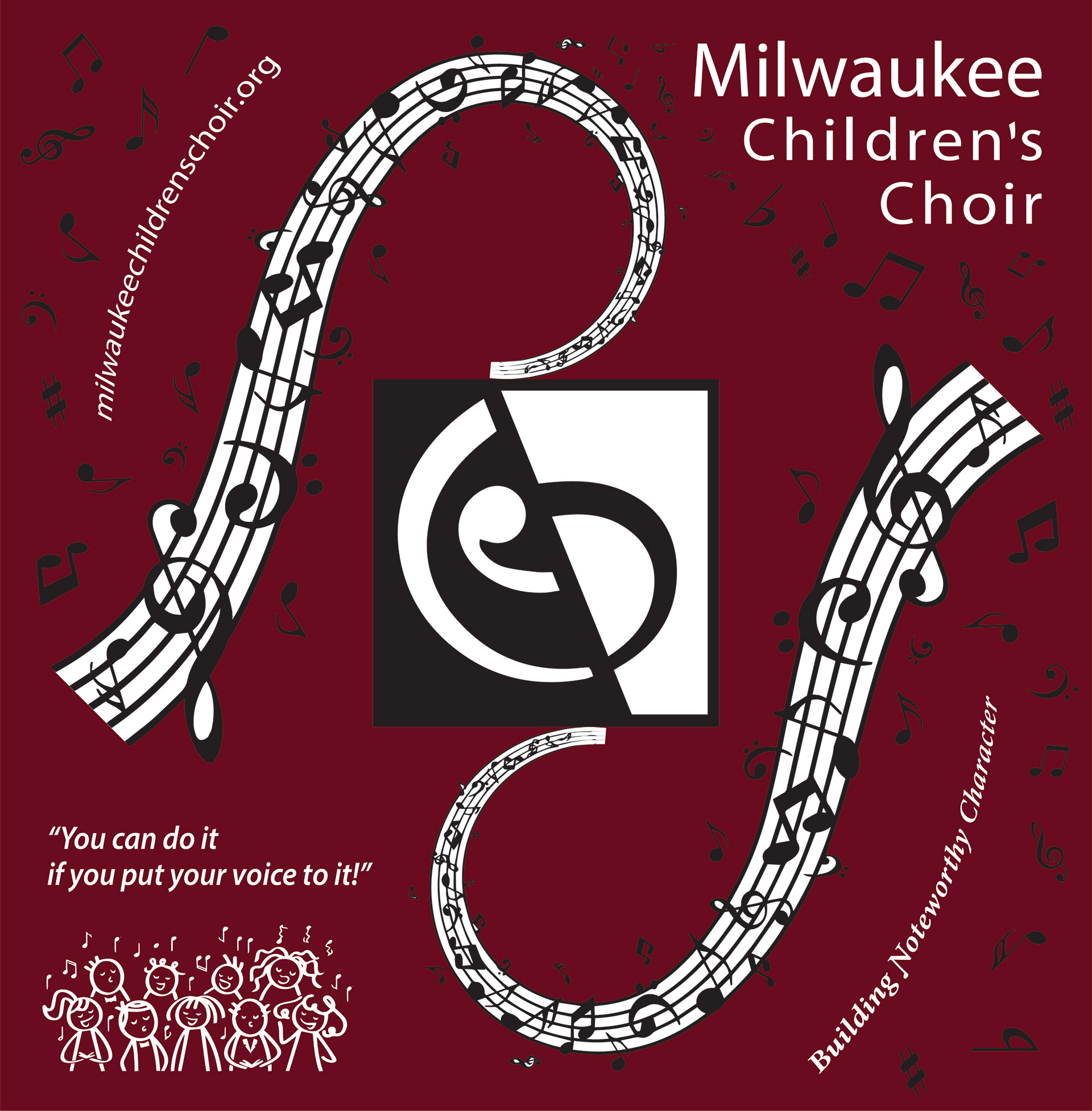
Milwaukee Choir Children Shirt

Parents Raster Design This was sent to start the basis for the shirt. Only problem is that is was raster and will not print great when blownup in scale. https://milwaukeechildrenschoir.org/

Raster into Vector With all their art given to me in Raster form I started to convert everything to Vector so it would print that much easier. https://milwaukeechildrenschoir.org/

MCC Back Design (Phase III) Third rendition didn't change a whole ton from the second one. Kept all info generally the same and added their slogan above the website. https://milwaukeechildrenschoir.org/
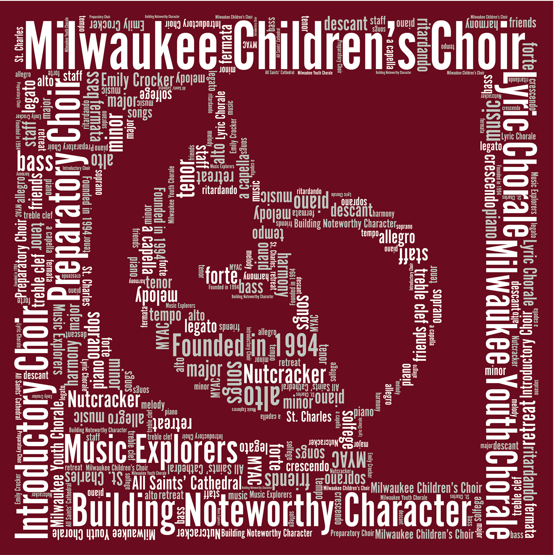
Back Design (My Own) This is my own version of the back design, a bit busy but shows movement and a more interesting layout, and again all vectorized to ensure high print quality. https://milwaukeechildrenschoir.org/

Back Design Phase II The second rendition with a good critique. Simplifying information and enlarging the text. https://milwaukeechildrenschoir.org/

MCC Back Design Another Option

MCC Front Design After creating a Vector of the art I was given I changed some of the coloring in the words to stand out more than others. This is the final front design they went with!! https://milwaukeechildrenschoir.org/
Parents Raster Design This was sent to start the basis for the shirt. Only problem is that is was raster and will not print great when blownup in scale. https://milwaukeechildrenschoir.org/

Back Design Phase I My first rendition based off the information I was given and to include. Adding a White Barrier to exclude the inside info from the outside info. Again Vector format. https://milwaukeechildrenschoir.org/
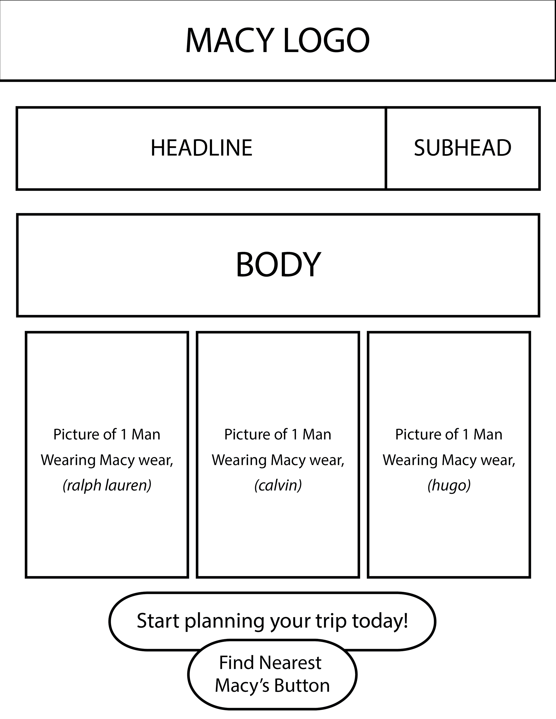
Macy Email Spec Ad

Macy Email Spec Ad Rough Layout 1 https://www.macys.com/

Macy Email Spec Ad Rough Layout 2 https://www.macys.com/
Macy Email Spec Ad Rough Layout 3 https://www.macys.com/
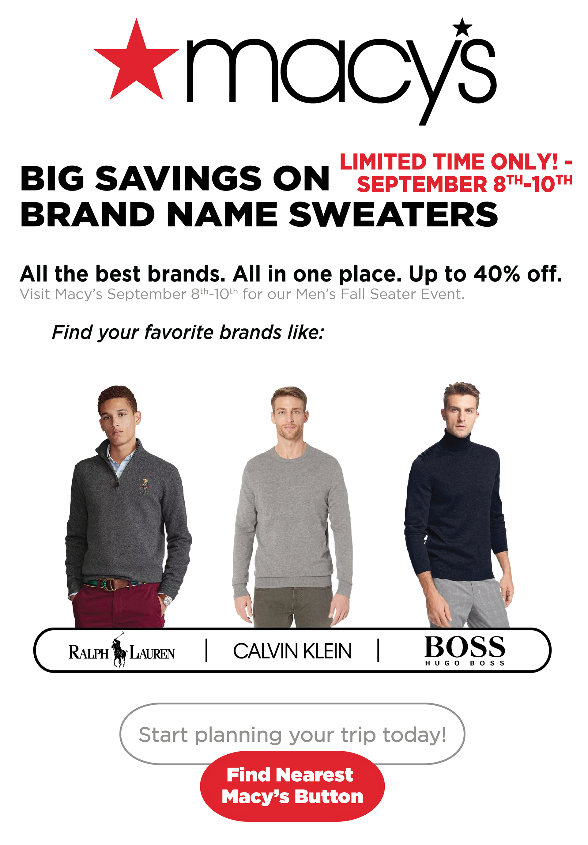
Macy Email Spec Ad Final Layout!! https://www.macys.com/
Johnson&Johnson Email Spec Ad

Johnson&Johnson Email Spec Ad This is an insert in an email they want to send to customers giving them a discount on product and wanting them to purchase more in store. Enticing their audience for more info. Jared from Upwork the 3rd party was a blast to work with. Hope to do it again soon!! https://www.jnj.com/

Rough Layout 2 A second rendition of a rough layout for the email spec ad. https://www.jnj.com/
Final Layout Design 1 The first final layout designed and awaiting input from client! https://www.jnj.com/

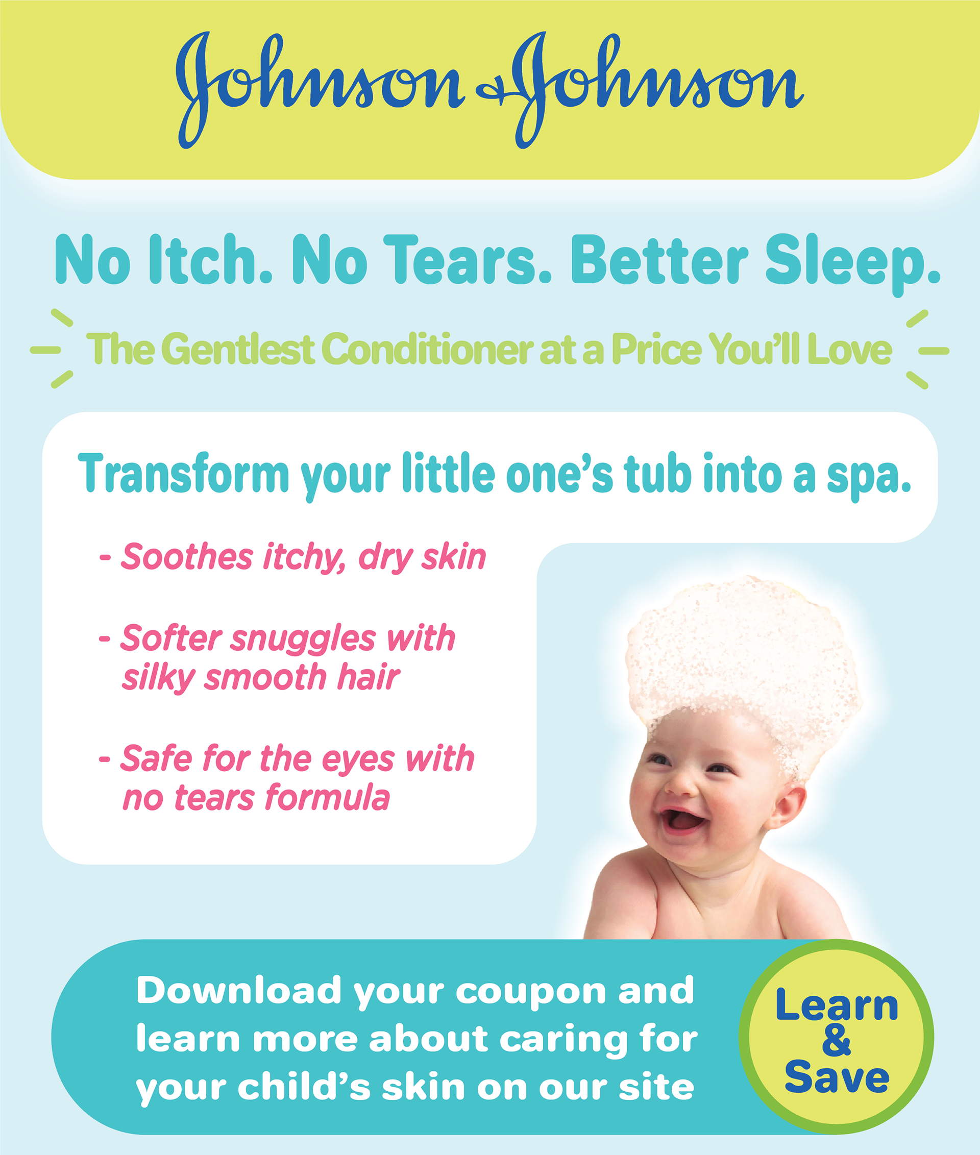
Final Layout Design 2 The final description of changes. The one the client went with. https://www.jnj.com/
FotoFab Icons and Microphoto Logo Revamp
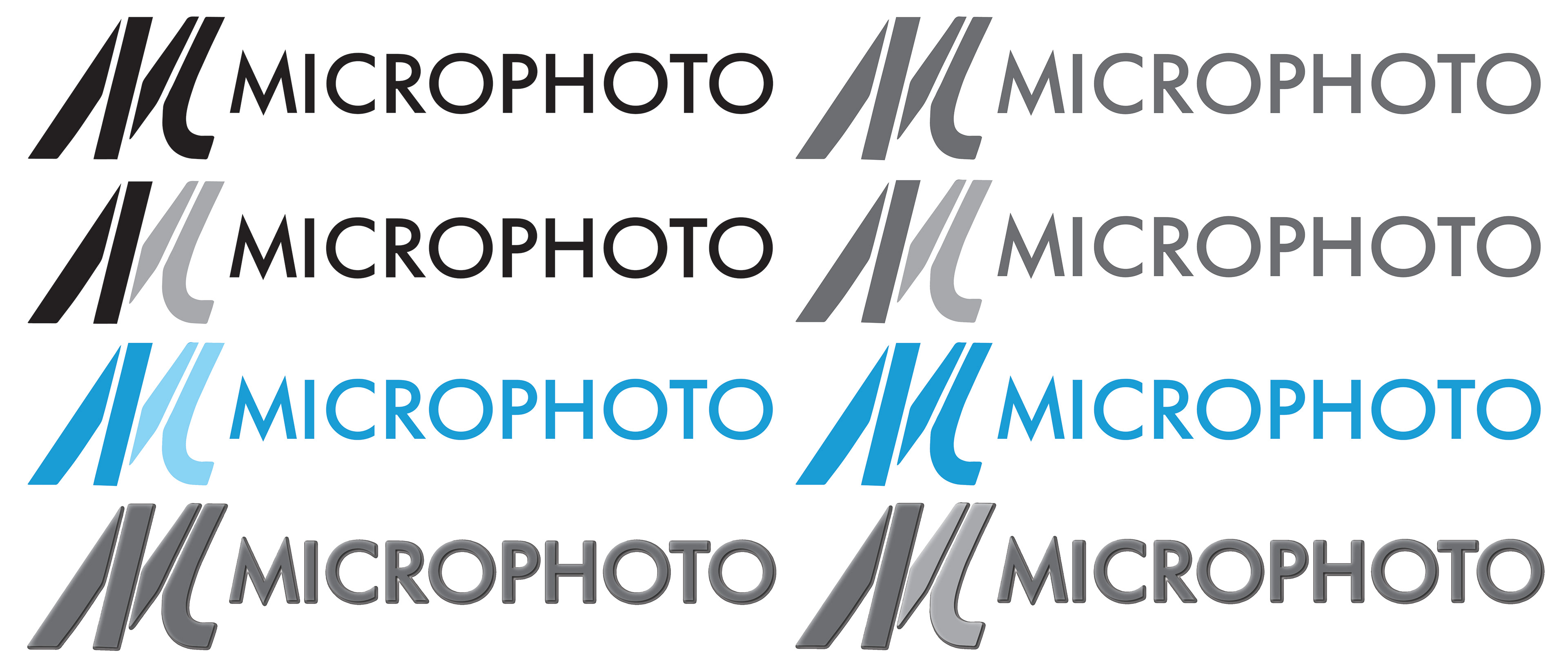
Microphoto Logo. Was once just a Raster image. But now brought to life at any scale being Vector. Enjoy!!

First time creating icons. 27 Icons in fact! I created in White. Some a bit more detailed than others. All in Vector for printing perfection!!

First time creating icons. 27 Icons in fact! I created in Black. Some a bit more detailed than others. All in Vector for printing perfection!!

First time creating icons. 27 Icons in fact! I created in Green. Some a bit more detailed than others. All in Vector for printing perfection!!
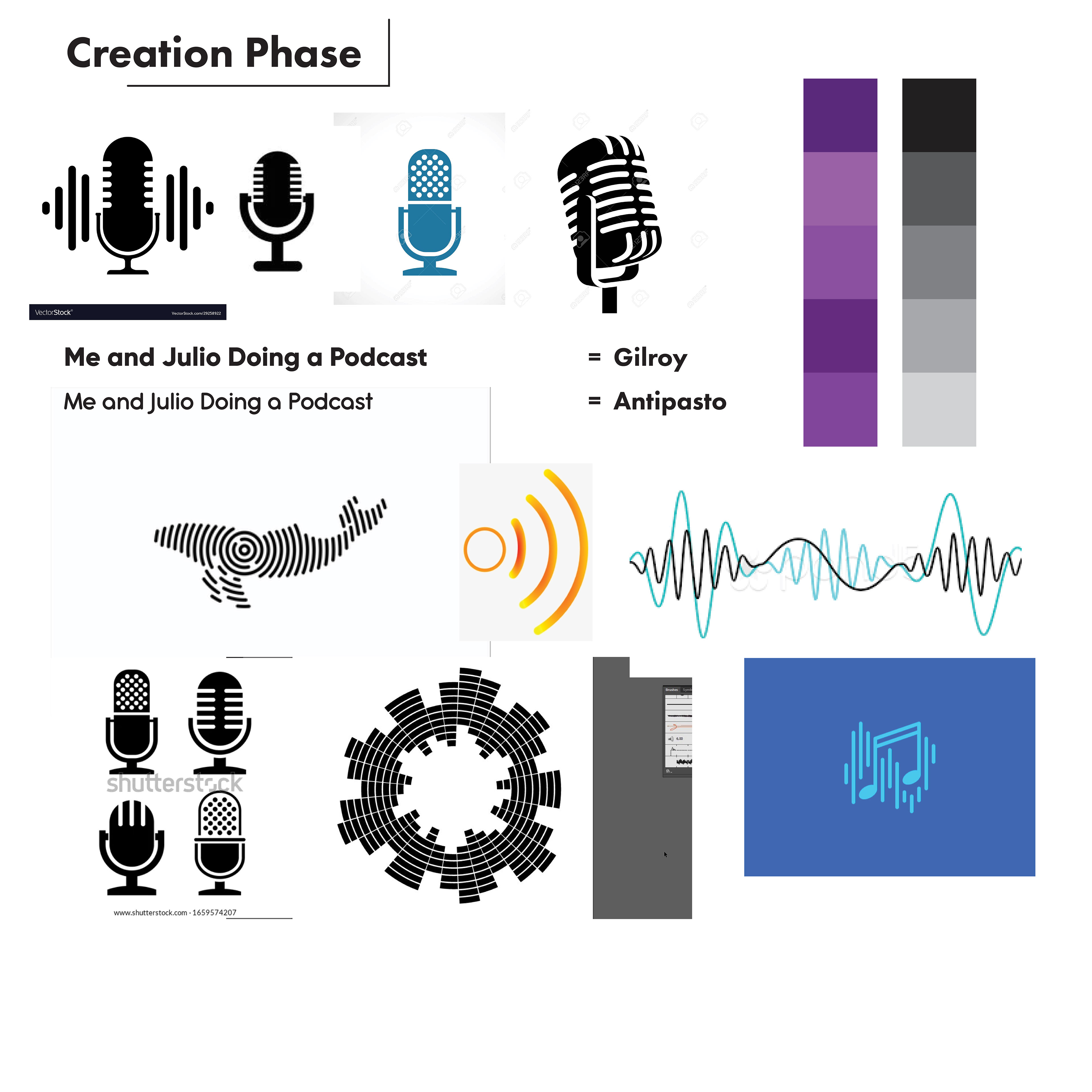
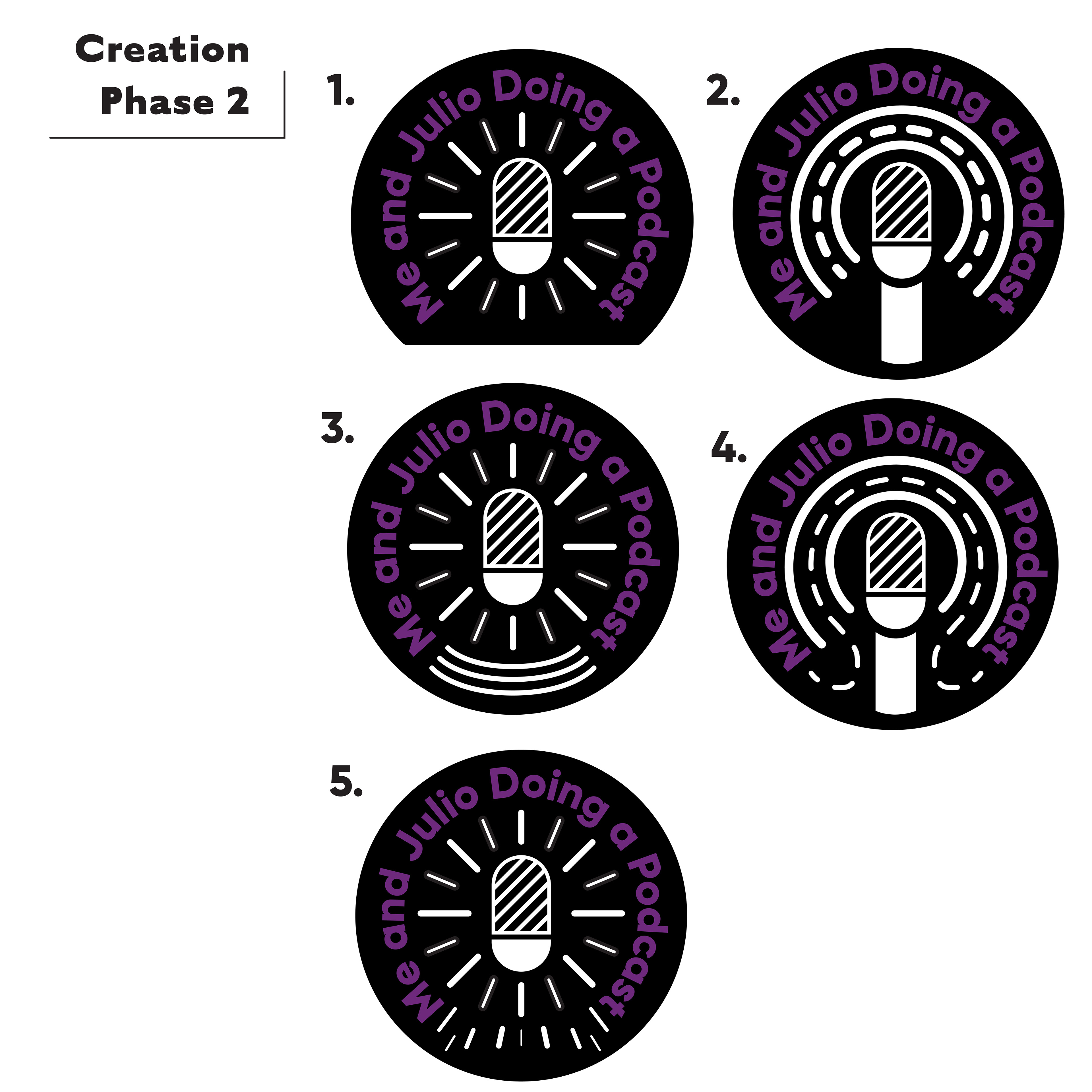
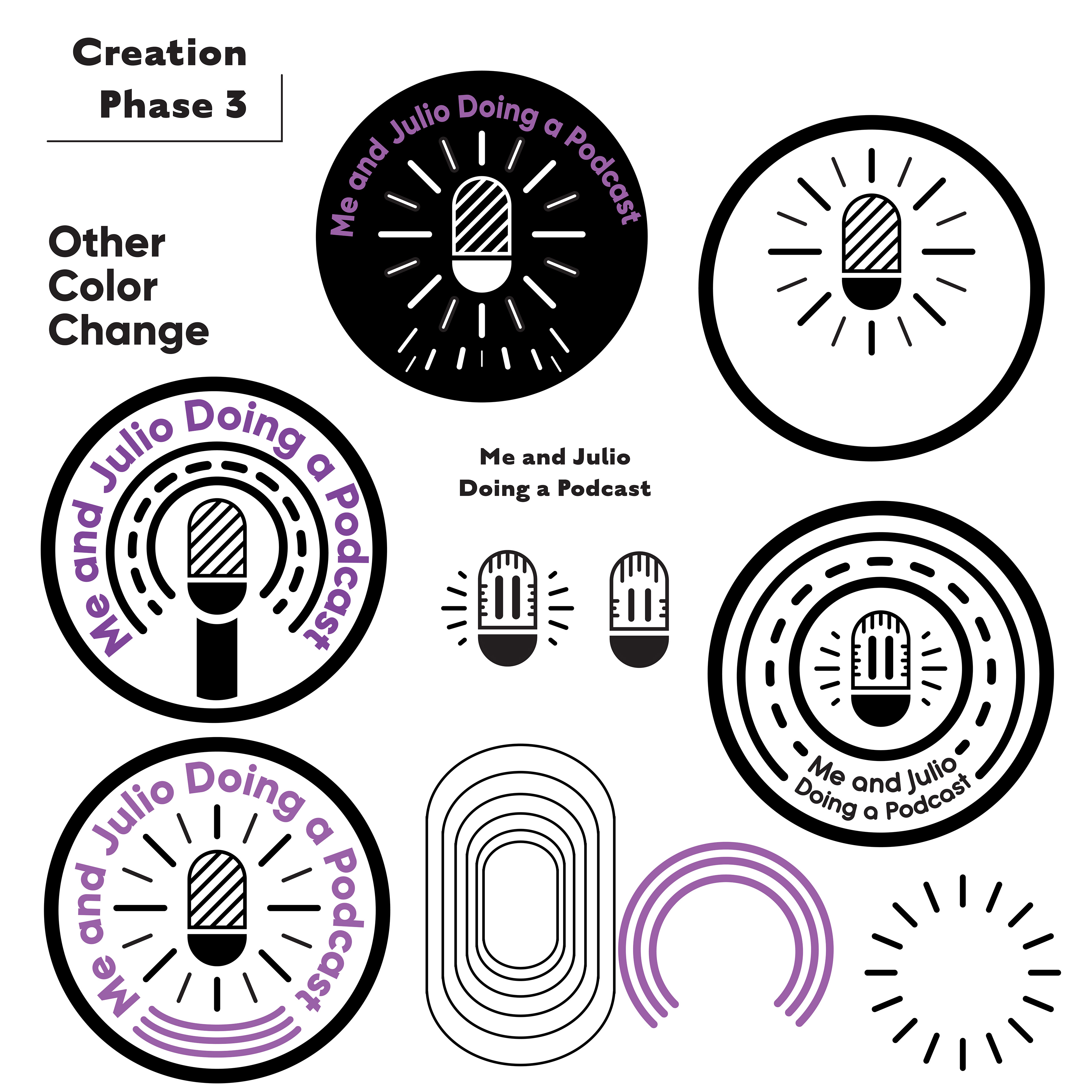
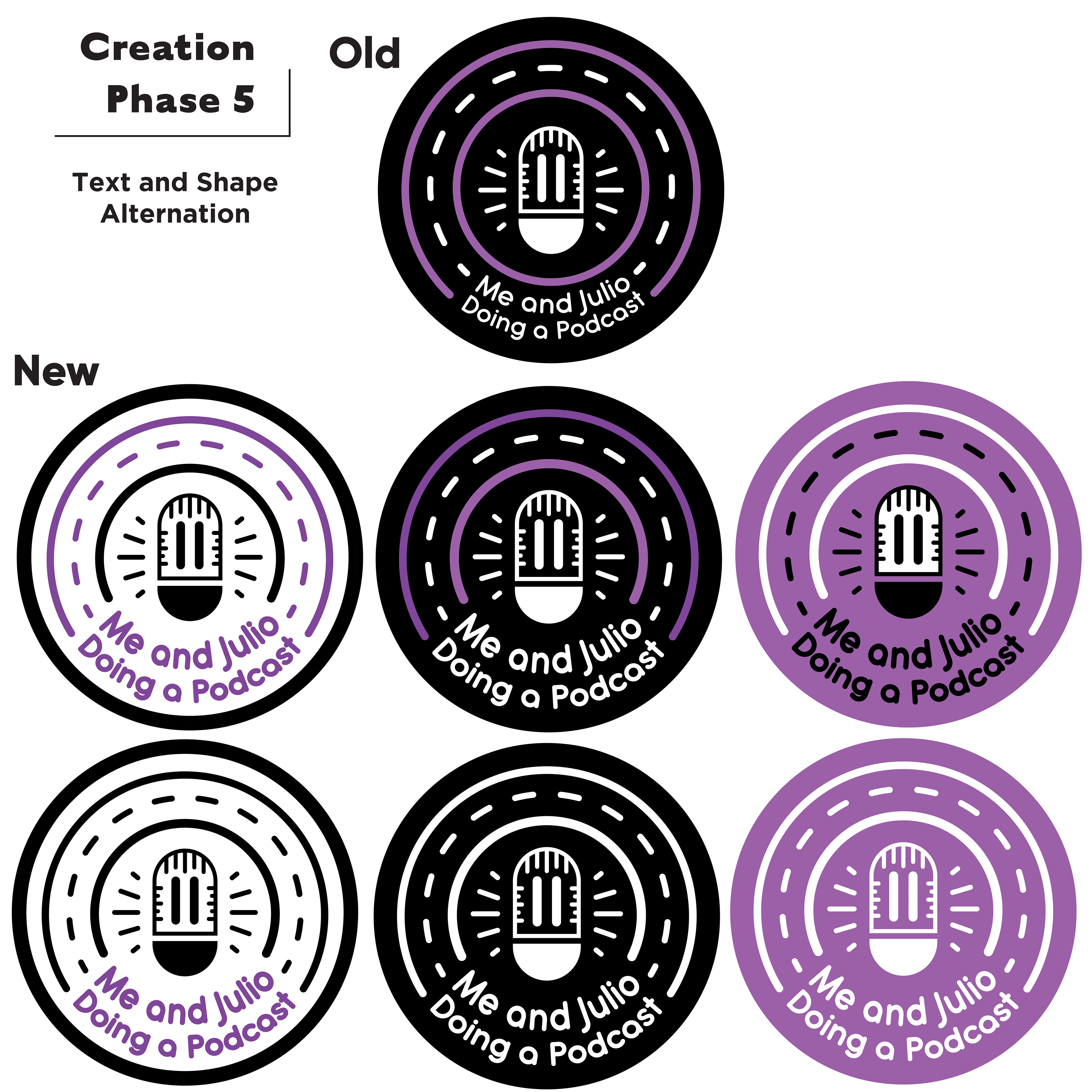
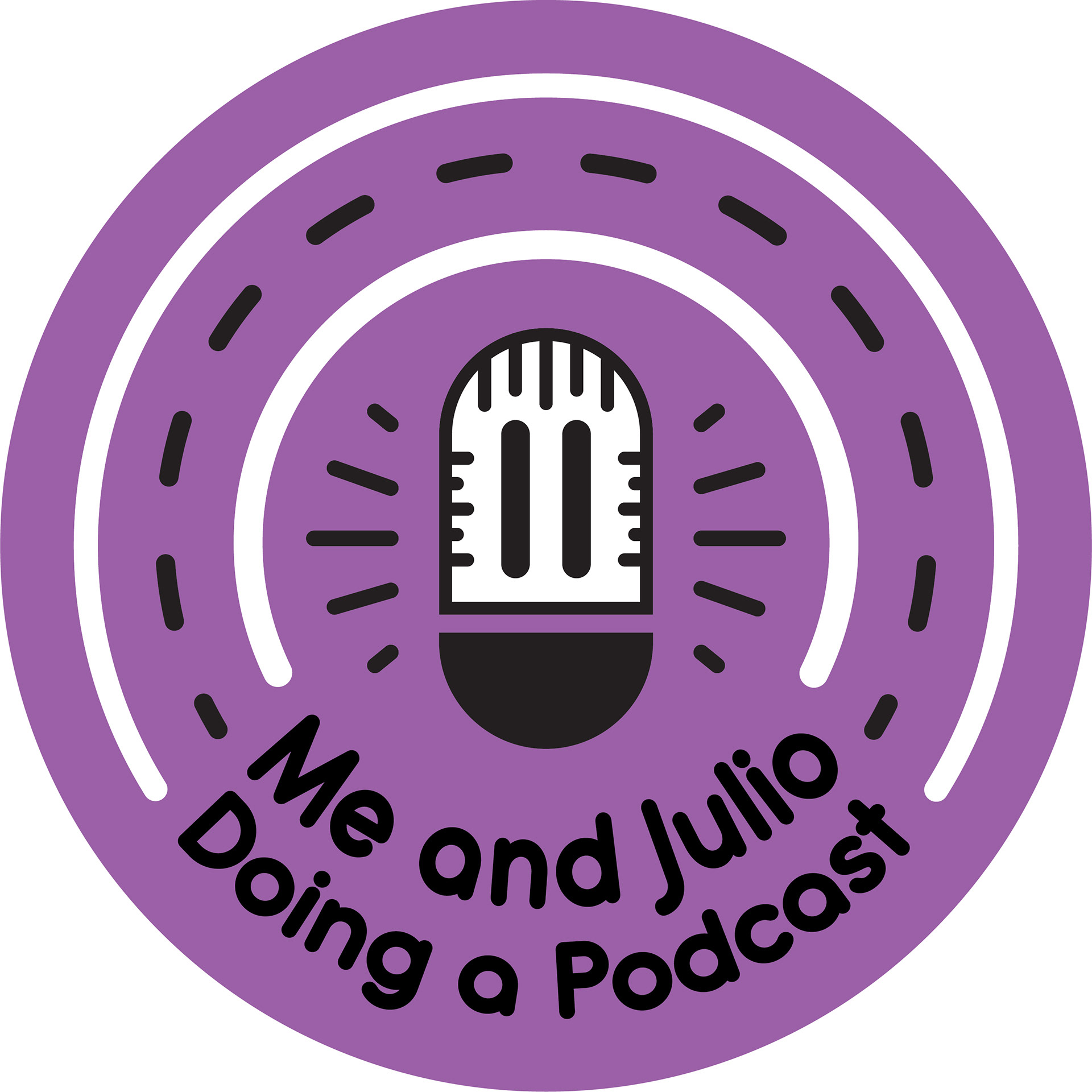
Julio Greaser Podcast Logo